Horizontal Smooth Scrolling With CSS
Create a carousel that scrolls smoothly Horizontally with css and flexbox
While working on the redesign for this expats blog, I had to create a simple instagram carousel, the one that is in the footer. It turns out that is very simple to do it with some basic CSS.
Here is the basic HTML:
<div class="carousel">
  <div>
    <img
      src="https://www.thexpatmagazine.com/static/da337e52c5c4fda4a74746c4dd0a583a/c47ac/73407466_813608455724510_1199731244955230163_n.jpg"
      alt="The Expat Magazine in Instagram"
    />
  </div>
  <div>
    <img
      src="https://www.thexpatmagazine.com/static/c6dc076adea0a7330c996f0d014f8b15/c4d4c/75341471_400626140890704_8449279261212390382_n.jpg"
    />
  </div>
  <div>
    <img
      src="https://www.thexpatmagazine.com/static/bb15373ec0f09200ac64a39bf9813c47/7ed2b/69258652_194314211570668_674865124513666831_n.jpg"
      alt="The Expat Magazine in Instagram"
    />
  </div>
  <div>
    <img
      src="https://www.thexpatmagazine.com/static/c20643536ef277a98ad3c52e7550ec49/7ed2b/69251740_149692732903083_5144742672846823710_n.jpg"
    />
  </div>
  <div>
    <img
      src="https://www.thexpatmagazine.com/static/c6dc076adea0a7330c996f0d014f8b15/c4d4c/75341471_400626140890704_8449279261212390382_n.jpg"
    />
  </div>
  <div></div>
</div>
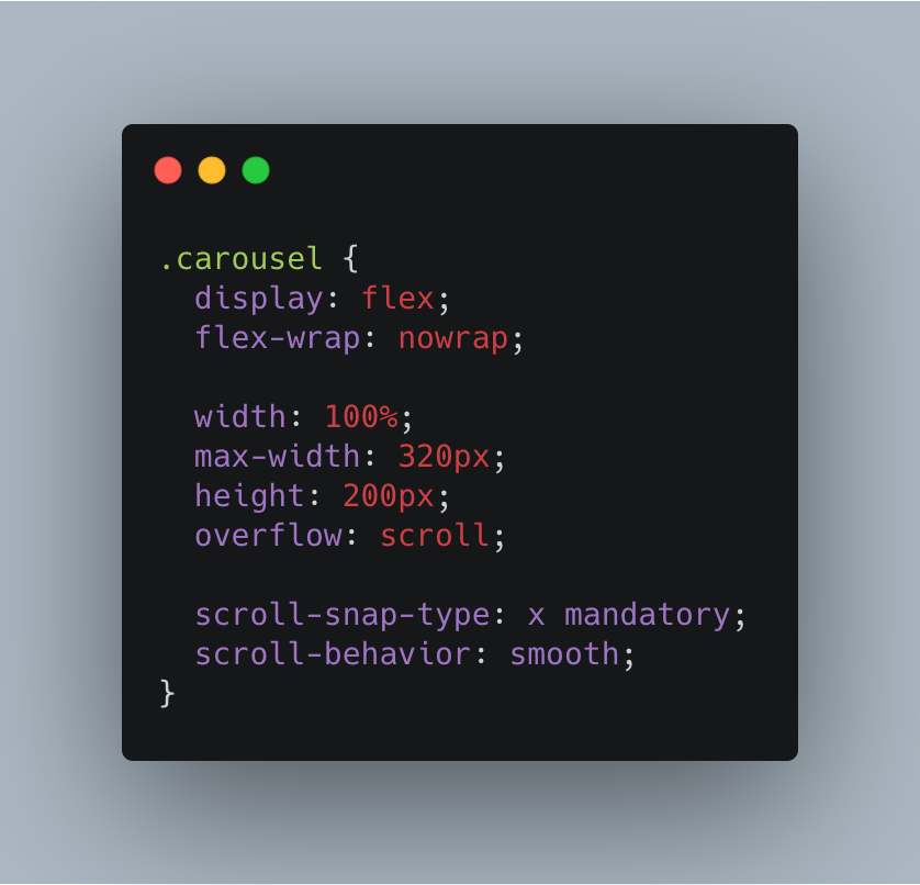
Set the container to display: flex;, nowrap and with overflow: scroll so that now we can scroll horizontally.
/* The container */

.carousel {
  display: flex;
  flex-wrap: nowrap;

  width: 100%;
  max-width: 320px;
  height: 200px;
  overflow: scroll;

  scroll-snap-type: x mandatory;
  scroll-behavior: smooth;
}
We improve the scrolling with scroll-behavior: smooth and then we set the scroll-snap on the X axis. As for the MDN website
The visual viewport of this scroll container will rest on a snap point if it isn't currently scrolled. That means it snaps on that point when the scroll action finished, if possible. If content is added, moved, deleted or resized the scroll offset will be adjusted to maintain the resting on that snap point.
Basically we just snap the element to their container (try scrolling and see how it snaps to the left side of the carousel). Then in the child element:
.carousel > div {
    flex: 0 0 auto;
    max-width: 320px;height: 100%;
    scroll-snap-align: start;
}
flex: 0 0 auto; sizes the element based on its width/height, or the width and height of their container. This is why I am setting the max-width to 320px (just to set a minimum value).
Finally we simply make the image a bit better responsive (In the blog I am using Gatsby Image for rendering a responsive image).
.carousel img {
    max-width: 100%;
    width: 100%;
    height: 100%;
    object-fit: cover;
}
Since we have set a fixed height for the carousel and that the image container has a height of 100%(height in percentage of an element works on if their parent has a defined height) we can use object-fit to make the image fit the container width without looking stretched. Finally since we set the object-fit property, then we need to set the height to be 100%.
Now we have a very simple, practical and quick Horizontal scrolling carousel.